
It may not be too difficult to imagine this scenario: You spend months, maybe even years, finding, collecting, and analyzing data on an important health policy matter that can contribute greatly to public policy. Next, you create graphs that summarize your findings. You’re careful to make sure these visualizations are true to your research, so you include error bars or report out other aspects of the underlying statistics and caveats and carefully label the chart to capture the complexity and nuances of the findings.
Finally, you add these graphs to your policy brief (you needed some visuals anyway), and publish the brief on your site. But, alas, your findings don’t seem to register among the elected officials you’re trying to reach, even those with whom you have a direct rapport.
Why aren’t people paying attention, you may rightly ask. One answer is the digital age in which we live, where people are blasted repeatedly with information from multiple sources. We’re all overwhelmed with what we’re trying to digest, but there isn’t much you alone can do to change our information culture. However, rather than ask why people aren’t paying attention, perhaps instead you could ask, what can I do better to create graphs and maps that stand out.
Getting Your Data Noticed
Over the years, working in philanthropy at the Lucile Packard Foundation for Children’s Health and the California Health Care Foundation, funding projects to transform data into impact, I’ve been at this crossroads where academic research and community or policy-level action meet, and I find there are tried and true tactics for getting data noticed.
Create data stories, not data visualizations: Instead of focusing solely on the graph or map, add context (photos, clarifying text, quotes) that allows you to unpack findings.
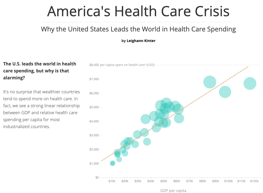
Data stories can take multiple forms: a slideshow, an infographic, or a poignant story about an individual that helps people put a face to generalized findings. Mixing data with stories may feel awkward for academics trained in reporting analyses objectively; one form of data storytelling that may seem comfortable is a Q&A approach, similar to what is found in this piece which explains with a question-based narrative why the U.S. leads the world in health care spending.
- Talk to your end-users: There’s no harm in making direct contact with your target audience – for example, staff for an elected official. Go grab some coffee and ask them informally about how you can make your findings relatable to them. They will no doubt appreciate that you’re taking the time to ask. Inquire about their use cases – that is, where will they be when they need to digest the findings or present them to their elected official? Walking in their shoes in this way may give you an idea of how to present the information effectively. You may learn, for example, that a presentation format that works well on mobile devices is appropriate, if the audience is on the go or not at their desk when they attempt to absorb or share your research.
- Don’t start with the full story: You’re probably passionate about your research – and rightly so. That understandably can lead you down a path of explaining everything, at once, figuring that others, too, will care as much as you do. The truth is your audiences may not be initially as invested as you are, at least not yet.
There’s a notion in the communication world called “quick depth” to help combat this. Quick depth basically means that it pays for you to start with a brief summary, even a graph that serves as the “cover story” to your findings. That leads people to a fact sheet, one-pager, or some other executive summary. And, finally, you can send people to that larger 10-20 page report that, admittedly, still feels inadequate to summarize the fullness of what you found.
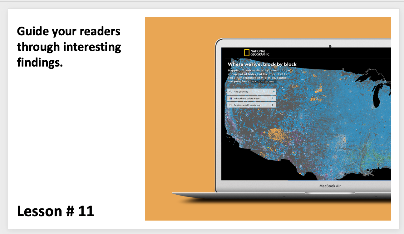
Another approach is to create a way to present all of your findings alongside a curated set of slides or bullet points that helps busy people navigate through your data, just as National Geographic did with the “regions worth exploring” section from their analysis of where we live, block by block.
There are many other tips you can employ to help ensure your data are presented in ways useful to end-users. I put together a video series exploring effective communication of data, which includes finding ways to help readers understand large numbers (which can be too abstract to appreciate viscerally). If you really want to dive into the topic, you can join (for free) the Data Visualization Society, which offers an active Slack group where individuals worldwide trade ideas on creating graphs, maps, and other visual representations of numbers.
For those interested in live in-person training and engagement, next month February 10 – 11 AcademyHealth will host their annual data conference, Health Datapalooza, which includes a workshop titled “HDP Rapid Fire: Innovative Methodologies and Approaches to Leverage Data Today”.