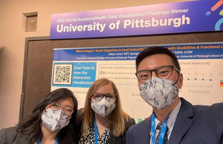
We had the opportunity to participate in the 2023’s National Center for Health Statistics (NCHS)/AcademyHealth Data Visualization Challenge and created the interactive visualization project titled “Who's Hungry?: Racial Disparities in Food Insecurity for Individuals with Disabilities & Functional Limitations.” In order to analyze patterns of food insecurity among individuals with disabilities and other functional limitations, we linked public-use files from the NCHS’s National Health Interview Survey (NHIS) public-use files and the U.S. Bureau of Labor Statistics’ American Time Use Survey (ATUS).
Our group was formed after meeting at the AcademyHealth Annual Research Meeting in 2022. We came from the University of Pittsburgh’s School of Public Health and School of Health and Rehabilitation Sciences with different backgrounds in health policy, physical therapy, and social work. We decided on our topic of food insecurity, which has been associated with severe and detrimental impacts on individuals’ health. Additionally, disability and functional limitations often interconnect with social determinants of health to create higher levels of risk for vulnerable populations, and we were interested to see how racial and ethnic disparities interacted with these risks. We chose the publicly available NHIS and ATUS data because they provide rich measures of experiences and behaviors associated with food insecurity, such as lack of affordability and starvation, that are unavailable in other data sources commonly used in health services research. Both datasets offer clear documentation, data dictionaries, and explanations on how to use the data appropriately, which made them accessible for our research. Our varying expertise strengthened our work and facilitated a successful multidisciplinary collaboration on the project.
To create our final visualization, we considered many different platforms before ultimately selecting Infogram. Infogram offers user-friendly, coding-free methods for creating dynamic and interactive data visualizations. We were able to concisely present our data with multiple different charts and graphs, while allowing viewers to see more specific data points and subpopulation data with interactive options.
As winners of the challenge, we attended the 2023 Health Datapalooza conference to present our work and engage with health data researchers and scientists in the field. We presented our poster, joined in discussions with other conference attendees about our project, and relevant work in this field. Additionally, we networked with professionals and patient representatives at various sessions.
What most sparked our interest in participating in the challenge was the chance to stretch our data visualization skills and to apply our research interests to a topic that was unfamiliar to us. We are accustomed to creating tables and graphs for research publication purposes, yet we have far less practice creating concise infographics to communicate research data. These types of visualizations are crucial for distilling complex research findings into simple and digestible information for diverse audiences, especially those who may lack research backgrounds, which fosters accurate dissemination of our research. Having a cross-departmental collaboration was also very beneficial to us, as our unique perspectives gave us the ability to thoughtfully translate our results to a wide variety of disciplines.
If you are a current graduate student, we would encourage you to participate in the 2024 NCHS/AcademyHealth Data Visualization Challenge. Applications are open now through March 11, 2024. Apply today for the opportunity to stretch and grow your data visualization skills and to share your research findings in a unique way.